Data Visualization with Microsoft Power BI for Data Science
Master Power BI to build Business Intelligence report and perform Power BI Analytics with this Power BI training
4.35 (76 reviews)

2,683
students
2.5 hours
content
Dec 2022
last update
$44.99
regular price
What you will learn
You will learn to create various Visualization charts in Microsoft Power BI
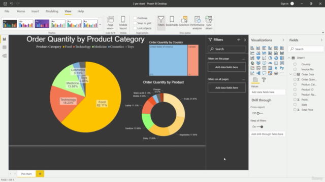
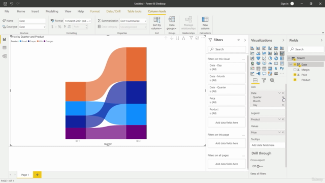
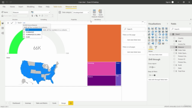
You will be able to create various charts such as Bar, Pie, Line, Ring, Donut, Gauge, Ribbon, Treemap charts
You will learn to create Table and Matrix and perform various operations on charts
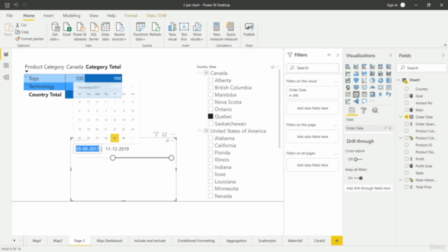
You will also learn some BI techniques such as Drill Down, Retrieving Web Data
You will learn to create a custom Measure and Calculated Field
You will learn to use Include and Exclude Function
You will learn to create and apply Slicer filters for categories and date
Screenshots
Related Topics
4056420
udemy ID
5/17/2021
course created date
8/12/2021
course indexed date
Bot
course submited by