Data Science:Covid-19 Data Analysis Visualization Deployment
A practical hands on data science Project on Covid-19 Data Analysis, Visualization(using Plotly Express) & Deployment
4.58 (13 reviews)

54
students
2 hours
content
Oct 2024
last update
$19.99
regular price
What you will learn
Data Analysis and Understanding
Data Preparation
Performing Feature Engineering
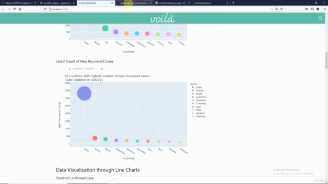
Learn to create Plotly Bubble and Bar Charts
Folium to visualize the data on world map
Pushing your notebooks to GitHub repository
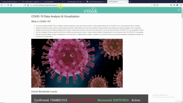
Deploying your project on Heroku Platform
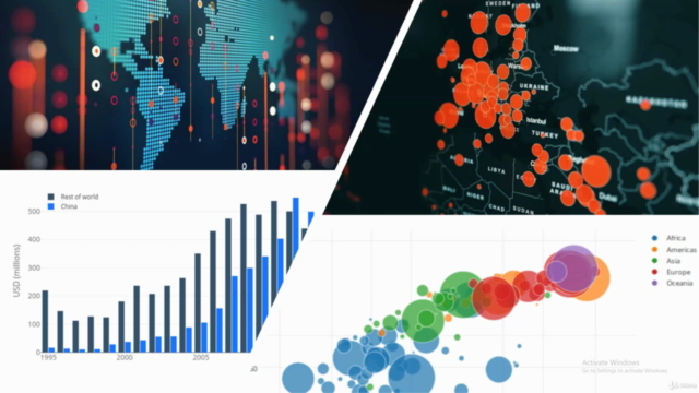
Screenshots
Related Topics
4021970
udemy ID
5/2/2021
course created date
5/28/2021
course indexed date
Bot
course submited by