Mastery of Flexbox and Grid (2 in 1 course) - Easy Guide
2 in 1 course to master Flexbox and Grid. Build Responsive Front-End Web Layouts using CSS Flexbox, CSS Grid and CSS.
4.59 (17 reviews)
191
students
34.5 hours
content
Jan 2025
last update
$59.99
regular price
What you will learn
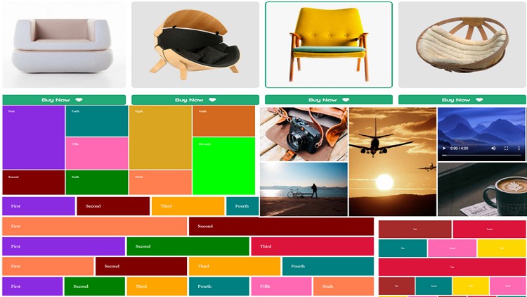
You will learn how to create various layout styles with CSS Grid and Flexbox
You will be able to create grid layouts using grid-template-areas
You will learn how to create equal and unequal columns/rows using both CSS Grid and Flexbox
You will be skilled on how to design MASONRY layout with flex and grid
You will learn how to use the fractional unit (fr) in CSS Grid
You will master how to create flex layouts with flex-basis
You will be skilled on how to work with implicit grid and explicit grid
You will learn how to use the CSS Media Query to make your web design mobile friendly and responsive.
You will learn how to create image gallery and video gallery with CSS Grid and Flexbox
You will be able to align and justify grid items and flex items
You will learn the difference between auto-fill & auto-fit in Grid
You will master how to use arbitrary grid line names in Grid
You will be able to work with ALL flexbox properties and ALL Grid properties step by step
You will creatively create the same web layout using flexbox and using grid
Related Topics
4655746
udemy ID
4/23/2022
course created date
6/7/2022
course indexed date
Bot
course submited by